
MN Twins
Design Refresh
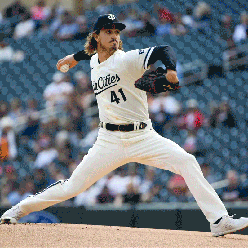
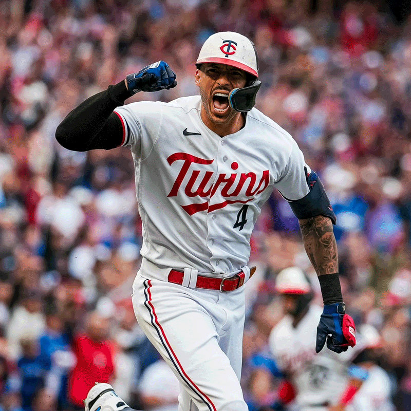
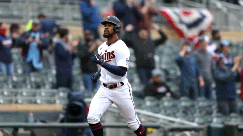
When we created the ad campaign for the Minnesota Twins, we also got a chance to refresh their aesthetic. It involved revised art direction and an overhaul of that season’s design system. We dug in deep developing dozens of ways in and these are a few favorites.
Design Exploration A - Tap/Click to View Large


Design Exploration B - Tap/Click to View Large


Design Exploration C - Tap/Click to View Large


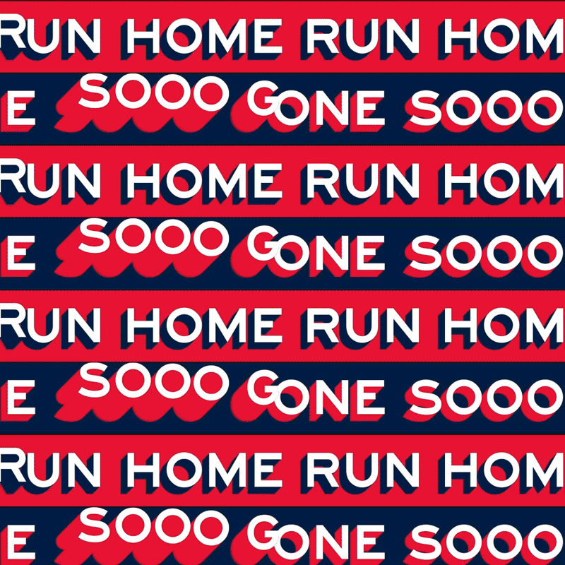
Final Design System: ‘Sota Style - Tap/Click to View Large
Social Story - Tap/Click to View Large
OOH


Social Feed - Tap/Click to View Large


In Game Animations - Tap/Click to View Large

Print - Tap/Click to View Large
CCO: Matt Burgess CD: Taylor Snyder D: Ben Engen & Erik Herberg CW: Harry deGrood